Driving safety interface · 2024
TouchlessGo keeps phone control in motion, without asking drivers to look down.
A gesture-controlled driving overlay for older cars without modern infotainment.
I · Problem
Older cars turn the phone into an unsafe control panel.
Navigation, music, and calls often live on a phone mount. Even simple actions require visual confirmation. TouchlessGo asks a smaller question: what if the hand gesture became the control, and the screen became only a confirmation surface?
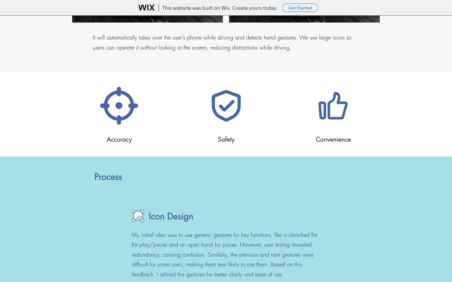
Accuracy
Gestures need to be distinct enough that users do not confuse adjacent actions.
Safety
The interface must reduce visual attention, not move distraction into a new form.
Convenience
The controls have to feel easier than reaching for the phone.
Auto takeover while driving · large icon states · gestures that can be remembered without reading
II · Process
The second version worked because the gestures got less clever.
Generic gesture mapping
The first gesture set covered the core functions, but some motions looked too similar or felt awkward to perform.
Distinct, easier motions
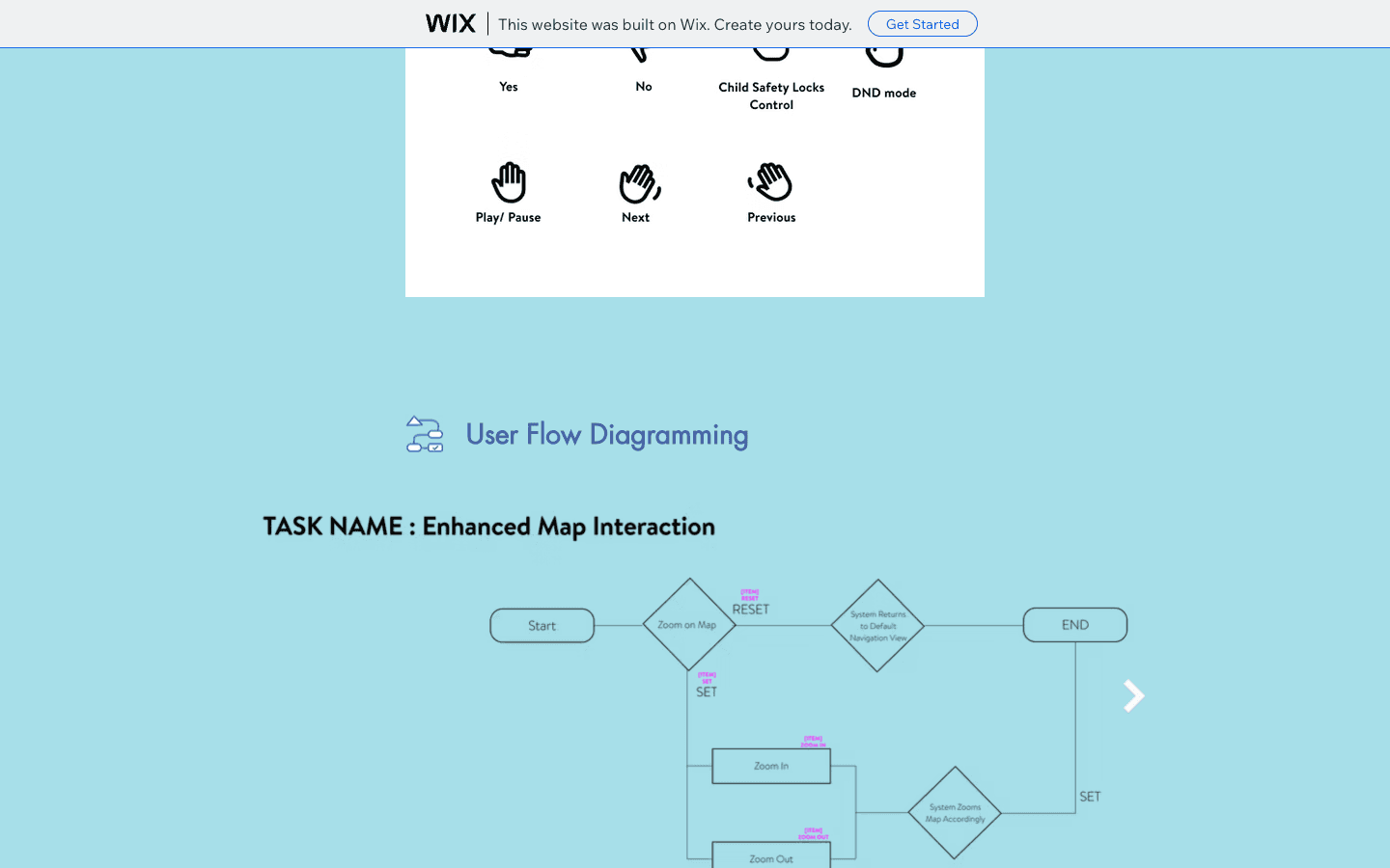
Testing pushed the gestures toward clearer silhouettes and lower physical effort, especially for previous and next.
III · Flow
Gesture control still needs a system map.
The flow work made edge cases visible: zoom, reset, return states, and when the system should confirm or ignore an action. A safer interface is not only bigger icons; it is clearer state logic.
IV · Outcome
The safest interface is the one that asks for the least attention.
In the second round of testing, users no longer described the gestures as confusing or physically difficult. That was the core result: the interaction became learnable enough to fade behind the driving context.